Taskbar
| Component of Microsoft Windows | |
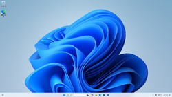
 Windows 11 build 26100.712 showing the taskbar in light mode | |
| Type | user interface |
|---|---|
| Introduced in | Windows 95 |
The taskbar is a user interface element used in Microsoft Windows and other operating systems that allows users to quickly switch between different tasks and windows, as well as provides easy access to core system functionality. In Windows, the taskbar includes the Start button for accessing the Start menu and the notification area with a clock, which can be used by applications to report their status.
Other operating systems and desktop environments, such as macOS, KDE Plasma or MATE also include an implementation of the taskbar concept.
History[edit | edit source]
Prior to the introduction of the taskbar in Windows 95, minimized windows were represented by icons on the desktop. In Windows 1.0, all open windows tile the screen, while minimized (iconified) windows are shown as icons in the lower part of the screen. The icon area also expands in height if more windows are open than could fit in the area, thus making sure all windows are always accessible unless a single window is maximized (zoomed). The introduction of overlapping windows in Windows 2.0 meant that windows, including minimized window icons could now be covered by any other window, which was later found to result in many users ending up losing track of their open applications, only to launch yet another instance of them, eventually running out of available memory. The rising popularity of Windows 3.0 and Windows 3.1, neither of which did not address the usability issues, lead Microsoft to search for a solution.
At first, the Cairo project tried to fix this problem by adjusting the appearance of minimized windows, as the developers believed that the main problem was that users had trouble distinguishing minimized window icons from other kinds of icons. The team therefore came up with wide plates with the window icon and title. The new user interface proposed by the project also included a so-called system tray, which could be either docked to any side of the screen or floating as a window. The tray included three buttons named System, Find and Help on one side, which provided simple access to basic system features, while the remaining area was occupied by a folder view, which functioned as a clipboard for users to drop files they are moving or copying and also included a Wastebasket folder for deleting files.
The Cairo user interface was later adopted by the Chicago project and included in early builds, such as build 58s, however, it turned out to perform nearly as bad as Windows 3.1 during usability testing. The team also worked in parallel on a separate user interface concept called ClearView with the aim to create an alternate shell for beginner users. ClearView used a full screen tabbed interface for launching programs, accessing recently opened documents as well as switching between windows. The tab bar on the top of the screen ultimately became the modern taskbar, with a Start button and buttons representing each window, and was eventually combined with other parts of the Cairo user interface to become the modern Windows shell.
Build 58s with the Cairo user interface
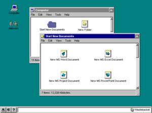
Build 73g showing the newly implemented taskbar
Build 90c with a single Start button
Windows Desktop Update[edit | edit source]
The taskbar was further refined with the Windows Desktop Update, which was included with Internet Explorer 4 as well as the succeeding versions of Windows. The ability to use custom toolbars (internally called deskbands) was added, which could be added to the taskbar but could also be docked on different sides of the desktop. Third party applications could also install their own toolbars. Built-in toolbars included a folder toolbar showing the items of a specified folder, which was used for the Quick Launch Bar, as well as the Address and Language Bar toolbars. The taskbar could now also be resized by dragging its outer edge.
For two brief periods during the development of Windows 98 and Windows 2000, a Show Desktop button was also added to the right corner, behind the clock. It was later removed in favor of a shortcut in the Quick Launch Bar with the same functionality, however, the feature remained in Windows CE and was later reintroduced in Windows 7.
Balloon notifications were introduced in Windows 2000 and Windows Me, which could be shown by application that showed an icon in the notification area. Windows XP added support for grouping taskbar buttons by applications when the taskbar was full. The taskbar could now also be skinned with the introduction of visual styles.
Windows 98 build 1415 with the Show Desktop button
Windows XP build 2419 showing the skinned taskbar
Longhorn[edit | edit source]
Similar to other parts of the shell, the taskbar was also affected by the user interface work during the Longhorn project. As early as build 3706, it was rewritten using the Avalon framework. The integration allowed parts of the taskbar such as the clock, notification area and the Quick Launch Bar to be moved to the sidebar, freeing up space for the taskbar buttons. At one point, the taskbar and sidebar could be combined into a single large bar docked to a side of the screen. Between milestones 3 and 5, taskbar buttons were centered as opposed to left-aligned, an arrangement which would not return until Windows 11.
After the development reset, the team reverted to the original Windows XP taskbar with minor improvements. The Start button was changed to the Windows orb, which was taller than the rest of the taskbar. Furthermore, when the Windows Aero theme was enabled, the taskbar was translucent and hovering over taskbar buttons showed window previews.
Build 3706 showing combined taskbar and sidebar
Build 4020 showing centered taskbar buttons
Build 4074 with the Aero UI enabled
Superbar[edit | edit source]
Windows 7 introduced an improved taskbar, commonly called the Superbar, which allowed users to pin applications directly to the taskbar, replacing the Quick Launch bar. Pinned applications were shown among other open applications and are only differentiated visually. Opening a pinned application shows its associated taskbar buttons in the same spot as the pinned icon, similarly to the Dock in macOS. Taskbar buttons can now also be shuffled around in the taskbar. A button to show the desktop has also been added to the bottom/right corner of the taskbar, hovering over which can optionally show the desktop temporarily along with transparent outlines of all open windows as a part of the Aero Peek feature.
Right-clicking a taskbar icon now shows a jump list, a menu which can be customized by each application to show commonly used tasks or recently open files. New customization options have also been added, which allow the user to restore the taskbar behavior and appearance from prior versions. By default, the taskbar uses large icons with no text which are always grouped per application, however, a small icons mode can be enabled. Options to show window titles and to group buttons only when the taskbar is full or not group at all are also available.
The Start button was removed from the taskbar in Windows 8, as the Start screen was now accessible by hovering over the bottom-left corner of the screen and clicking when a Start screen tile shows up. Right-clicking the popup shows the new Quick Link menu with links to several system utilities. Early builds also included a user tile on the taskbar in the bottom right corner, with options such as changing the account, logging off or switching the user, although the functionality was later moved to the top right corner of the Start screen. The removal of the Start button was promptly reverted in Windows 8.1 to address negative feedback caused by the change.
Windows 10 introduced new buttons to the taskbar for the first time since Windows 95, by adding the Cortana/Search and Task View buttons next to the Start button, the former of which could optionally be extended into a search bar. The Action Center was also introduced, which could be accessed initially from an icon in the notification area and later from a separate button next to the clock. In Windows 10 May 2019 Update, the Cortana/Search button was split up into a Cortana and a Search button. Later updates also added My People and News and interests to the taskbar, as well as a light mode.
An early iteration of the Superbar in Windows 7 build 6469
Later revision of the Superbar in Windows 7 build 6730
Superbar in the final version of Windows 7
User tile in Windows 8 build 7989
Windows 8 showing the taskbar without the Start button
Windows 10 showing new buttons on the taskbar
Windows 10 build 18282 showing the taskbar in light mode
Windows 11[edit | edit source]
The taskbar was rewritten in Windows 11 using WinUI and XAML Islands, together with other parts of the shell. The new taskbar is animated and considerably more colorful than in Windows 10. New buttons for accessing Widgets and Chat have been added, while hovering the Task View or Search buttons shows recent searches or virtual desktops, respectively.
Taskbar buttons are now centered by default, although they can be changed to left alignment in Settings. Flyouts for network, sound and power have now been combined into a single Quick Settings flyout, while the calendar flyout and Action Center have been merged into the Notification Center accessible by clicking the clock, which now shows the number of notifications, or if enabled, the Focus Assist/Do Not Disturb symbol.
The new taskbar no longer has the ability to display window titles along with icons, nor to group taskbar button (other than on per-application basis). The setting to change icon size has been removed from the Settings app, but the taskbar still supports small icons mode, as well as a new large icons mode, which is larger than the default size. The right-click menu on the taskbar has been reduced to a single item that opens the taskbar settings, although a Task Manager link has been readded upon negative feedback. Support for custom toolbars has been removed altogether. Windows 11 build 23466.1001 eventually brought back the ability to ungroup icons on the taskbar.
Windows 11 build 22000.51 showing the Notification Center
Windows 11 build 22000.51 showing the Quick Settings flyout


