User:Craig Kercher/Sandbox/1
| Build of Windows 11 | |
 | |
| Architecture | AMD64, ARM64 |
|---|---|
| Compiled on | 2021-06-17 |
| SKUs | |
| Home (N, Single Language, China) SE (N) Pro (N, Single Language, China Only) Pro Education (N) Pro for Workstations (N) Education (N) Enterprise (Evaluation, G, N) IoT Enterprise | |
| Product key | |
| Use a Windows 10 Retail serial | |
| About dialog | |
Windows 11 build 22000.51 is the first Insider Preview build of Windows 11, which was released to the Dev Channel on 28 June 2021.[1]. Photographs of this build being distributed in an internal corporate network and several screenshots were first posted by a Microsoft employee on 27 June 2021, but later removed.[2][3]
New features and changes[edit | edit source]
[edit | edit source]
This build continues the taskbar revamp by introducing a new system tray and flyouts. All flyouts that have been left untouched in the previous builds, as well as jumplists have been updated with rounded corners. The system tray also now uses the Segoe UI Variable font as a side effect of using WinUI.
The Action Center and other flyouts have been replaced by new flyouts. Notifications are now combined with the calendar flyout in the Notification Center, accessible by clicking the clock widget. When there are unread notification, the clock shows the count in a badge at its right side. Similarly, when Focus Assist is enabled, the clock shows a moon icon at its right.
Icons for network and sound, which have also been updated since the previous builds, now act as a single widget, which when clicked shows the new Quick Settings incorporating quick actions from the Action Center, as well as the sound volume slider and media playback controls.
The options to add shortcuts to commonly used folders to the Start menu has been added back, as well as the setting to show the taskbar on all displays in a multi-monitor configuration.
Apps[edit | edit source]
Some built-in apps have received significant overhauls in this build, often using the new Mica material introduced in WinUI 2.6 in their user interface. File Explorer has a new toolbar, replacing the previously used ribbon, which allows easy access to frequently used file operations, as well as sort, view and selection options. New menus have also been introduced, which include a mini-toolbar with common operations on the top or bottom, depending on the location of the cursor when the menu was opened.
The Settings app has been completely redesigned, introducing a layout that is similar to Microsoft Edge settings. The new settings app shows the main categories on the left side, while the right side shows the active page content. Unlike the previous iteration, the new design makes great use of consistent acrylic blocks stacked on top of each other.
The Store app has also been updated, although the new version is not included by default and has to be updated to first. The new Store has also undergone a major redesign and also now includes applications that are maintained and updated through third party channels.
Lock screen[edit | edit source]
This build introduces a new login experience. The time is now centered in the upper half of the lock screen. The controls on the login screen, such as text boxes and buttons have also been updated to fit in with Microsoft's new design language.
The progress screen now has a black background instead of the user's accent or default blue color and has been updated to use a bolder font. Similarly, the security options screen shown after pressing Ctrl+Alt+Del also uses a black background, although it is virtually unchanged otherwise.
User Account Control[edit | edit source]
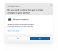
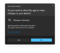
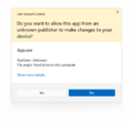
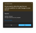
User Account Control prompts have been updated in a similar fashion to the rest of the operating system. The new prompts for apps signed by a known publisher are now gray rather than blue, while prompts for other apps use less vibrant color shades than in previous versions.
Other changes[edit | edit source]
- Snip and Sketch has been slightly redesigned in order to float from the side of the screen and have rounded corners.
- The icons for virtual desktops and Widgets have been redesigned since build 21996.
- Widgets panel now respects the user's 12/24 hour time settings.
- The "account information" tile in the top right corner of Widgets now displays the Microsoft account's profile picture.
- When using the SE SKU, a data security warning message may be displayed on the top right of the desktop.
- The reported version string has changed from "Dev" to "21H2".
- When a device is not in the Windows Insider Program, system crashes will display in black, rather than in blue.
System requirements[edit | edit source]
The TPM 2.0 and Secure Boot requirements can be bypassed by using dism.exe to directly apply the install image, or by disabling the checks altogether in the registry before running setup:
[HKEY_LOCAL_MACHINE\SYSTEM\Setup\LabConfig]
"BypassTPMCheck"=dword:00000001
"BypassSecureBootCheck"=dword:00000001
Alternatively, this build's install.wim can be used with the installer of a Windows 10 build, however, it may remove the ability to upgrade if an older build is used. Replacing the libraries responsible for the requirement checks, appraiserres.dll and appraiser.dll, with a version from Windows 10 on the install media has also been found to work.
Findings[edit | edit source]
Windows 10 shell[edit | edit source]
The new Windows 11 UI can be reverted to Windows 10 one using the following registry value:
[HKEY_LOCAL_MACHINE\SOFTWARE\Microsoft\Windows\CurrentVersion\Shell\Update\Packages]
"UndockingDisabled"=dword:00000001
It reverts Windows 11-styled taskbar and Start menu to 10-styled ones and enables Ribbon UI in Explorer. However, there are a few disadvantages:
- The taskbar doesn't host the clock.
- Win+X menu doesn't open.
- Search doesn't work in the legacy UI.
To get back the taskbar clock in the old UI, new user account needs to be created, however, clearing out the HKEY_CURRENT_USER\Software\Microsoft\Windows\CurrentVersion\Explorer\StuckRects3 key also found to work.
[edit | edit source]
The search bar on top of the Start menu that has been introduced in build 22000.65 can already be enabled in this build by the means of toggling a velocity feature. To do so, use a utility that works with velocity features, such as ViVe, and set velocity number 33192136 to enabled (2). Restart the computer afterwards to see the change.
Bugs and quirks[edit | edit source]
General[edit | edit source]
- Pressing F7 in redesigned components such as the Start menu, taskbar, or File Explorer shows a caret browsing dialog.
Explorer[edit | edit source]
- When
explorer.exeis started from the SYSTEM account, the older Windows 10 taskbar will appear in place of the new one. - Windows Explorer is stuck in a crash loop in Safe mode. This is caused by the
Capability Access Manager Serviceservice failing to start. See Windows 11 build 22000.51#Windows 10 shell for fix. - The old ribbon, menus and search are used when the user navigates to any file system location from a Control Panel page.
- The toolbar and menus may use wrong colors and icons when a mismatched Windows and app theme is used.
- On some laptops, when the battery is fully charged, Windows Explorer may go into a restart loop. Disconnecting the laptop from power or disabling the battery in the Device Manager usually solves the problem.
Taskbar[edit | edit source]
- The animation for changing the taskbar icon alignment is broken in this build.
- The transition between two adjacent taskbar thumbnails does not render.
- The blur background effect on the taskbar thumbnails may disappear when hovering on it for seconds.
- Windows Terminal shortcuts within the Win+X menu are hard-coded to the stable version of the application and are broken if it's removed.
- The taskbar may stop accepting input after a while, requiring the user to restart the Windows Explorer process.
- Some apps such as
winvermay show without any icon in the taskbar. - Hitbox of the Show Desktop button does not reach all the way to the corner.
Desktop Window Manager[edit | edit source]
- The taskbar may become fully transparent when installing graphics drivers.
- Window frames appear squared under some configurations or during the close animation.
- The red background of the Close button when hovered or pressed may not fill the entire corner, leaving a thin line around it.
- Dropdown menus may fall back to square corners in some applications after being shown once with rounded ones.
- The animation on modern/UWP-styled dropdown menus during expanding animation may causing context menu frame appear as squared before its switch back to rounded one.
Gallery[edit | edit source]
- Windows11 22000.51 EULA.png
EULA
- Win11 22000.51 Login Dark.png
Login
- 22000.51 NewStore.PNG
The new Store.
Black system crash
- Windows11-10.0.22000.51.-FileExplorerLight.png
File Explorer (light mode)
- Windows11-10.0.22000.51.-FileExplorerDark.png
File Explorer (dark mode)
- Windows11-10.0.22000.51.-SnipandSketch.png
Snip and Sketch
- Windows11-10.0.22000.51.-NotificationCenter.png
Notification Center
- Windows11-10.0.22000.51.-QuickSettings.png
Quick Settings
Explorer crash in Safe mode
